
Last year, I sat across from a CEO in Osaka who handed me a business card so dense with text it looked like a ransom note. “I need to stand out,” he said. “But I don’t want to look like I’m trying.” Two weeks later, a wellness entrepreneur in Istanbul begged me, “Make me go viral — but keep it halal.”
What do these clients have in common? They thought personal branding was about visibility. It’s not. It’s about resonance.
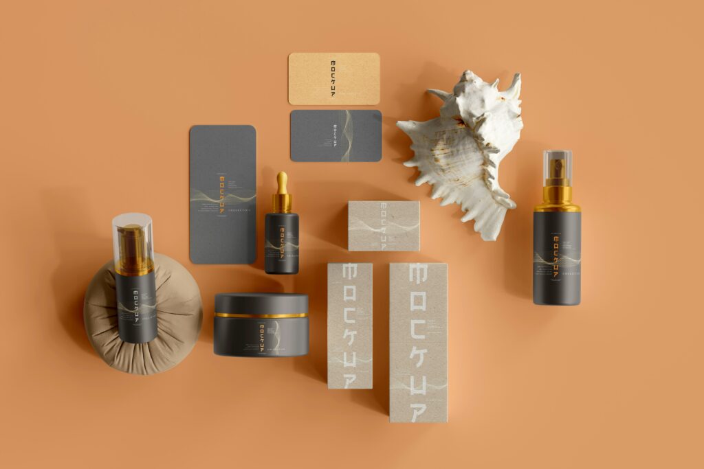
Personal branding isn’t a logo, a font, or a TikTok trend. It’s the art of translating your messy, contradictory humanity into a language your audience understands — without losing the magic that makes you you.
Here’s how to do it. No fluff.

1. Your Brand Isn’t a Mask — It’s a Mirror
Most people treat personal branding like a costume: What should I wear to get taken seriously? What colors say “innovative”?
Stop.
In Kyoto, I worked with a ceramicist who hated social media. “My work is quiet,” she said. So we built her brand around absence. Her Instagram feed? Empty kiln shelves, raw clay close-ups, and a single teacup every Friday. No face, no slogans. Her audience grew 300% in six months. Why? She mirrored her values, not the noise.
Actionable Truth:
- List 3 emotions you want people to feel when they encounter your brand (e.g., “curious,” “grounded,” “challenged”).
- Now, ruthlessly edit every element (photos, fonts, tone) to evoke those feelings.
2. The 60/30/10 Rule (No, Not Color Theory)
60% of your brand should be substance (what you know).
30% should be style (how you show it).
10% should be surprise (what only you can do).
A client in Istanbul ran a sustainable textile startup. Her “60%” was deep threads on natural dyes (LinkedIn carousels, podcast interviews). Her “30%” was a warm, earthy palette and Ottoman-inspired patterns. The “10%”? She closed every email with a photo of her grandmother’s loom and the line, “This machine outlived empires. Fast fashion won’t outlive us.”
Result: Investors called her “the Timeless CEO.”
Actionable Truth:
- Audit your last 10 social posts. Are you all style, no substance?
- Your “10%” should feel slightly dangerous — like a secret you’re sharing.
3. Culture Isn’t a Color Palette
Working across Turkey and Japan taught me this: Personal branding is cultural codebreaking.
In Japan, silence is a language. A tech founder’s website originally shouted (“#1 AI SOLUTION!”). We redesigned it with stark whitespace, subtle animations, and client testimonials in the margins. Trust skyrocketed. Why? In Japan, loudness reads as desperation.
In Turkey, where hospitality is sacred, a CEO’s sterile LinkedIn profile felt cold. We added a banner of his team drinking çay (tea) at a street stand and a “Before You Work With Me” guide with family recipes. Clients said, “Finally, someone who feels like bizden (one of us).”
Actionable Truth:
- Ask: “What’s rude in my audience’s culture?” (e.g., Overpromising in Germany, underselling in the U.S.).
- Use local metaphors, not just translations.

4. The “Ugly Phase” is Mandatory
I once rebranded a Tokyo sushi chef who insisted on using Comic Sans (“It’s playful!”). I didn’t argue. I showed him 10 fonts on mockups of his menu. At font #6 (a sleek, serif-inspired type), he gasped. “きれい ” he said. Beautiful.
Your first draft should embarrass you. The logo you sketch on a napkin, the cringe mission statement — these are necessary. Clarity comes from collision.
Actionable Truth:
- Write your brand’s “ugly” manifesto first. Example: “I help people. I’m good at stuff. I want money.”
- Now refine it without losing that raw honesty.
5. You’re Allowed to Outgrow Your Brand
Two years ago, my own brand was all neon gradients and “GIRL BOSS” energy. Today, it’s minimalist, with a focus on “slow design.” Did I lose clients? Some. But the ones who stayed pay me triple.
A client in Nagoya feared pivoting from “queen of quick fixes” to “slow-burn strategist.” We kept her core color (crimson) but swapped jagged edges for soft curves. Her new tagline: “Fast results are fragile. Let’s build something that lasts.”
Actionable Truth:
- Every 6 months, ask: “Does this brand still fit, or am I squeezing into it?”
- Evolution ≠ erasure. Keep one anchor element (a color, a symbol).
6. The Unsexy Truth: 80% of Branding is Editing
A Turkish client’s original tagline: “Empowering synergistic solutions for dynamic paradigm shifts.”
We workshopped it down to: “We fix what your IT guy can’t.”
Boring? Maybe. Effective? His DMs flooded with “THANK GOD SOMEONE GETS IT.”
Actionable Truth:
- For every element (bio, logo, website), ask: “Would my 15-year-old niece get this in 3 seconds?”
- Delete jargon. Replace “leverage” with “use.” Burn “disrupt.”
Final Thought: The Coffee Cup Test
Imagine your brand is a coffee cup.
Most people obsess over the cup’s color, the font on the sleeve, the influencer holding it. But the coffee — the actual experience of you — is bitter, lukewarm, or worse, forgettable.
I don’t design cups. I design coffee.